
by William S. Kuttner, Senior Analyst, MPO Staff
What is the 2011-MTS?
During 2010 and 2011, more than 15,000 Massachusetts households agreed to participate in a travel survey. More than 37,000 individual members of those households—all above the age of five—reported all their travel over the course of an assigned survey day. The 2011-MTS has since proved to be a trove of statistical treasure that has been used in various studies. I had experience using and analyzing data from the preceding household survey, undertaken in 1991, and have now taken a fresh look at the new survey.
Data from a reasonably current household survey is critical for developing a reliable travel demand model that can be used to predict how regional transportation systems likely would function in the future under various transportation-investment or demographic-trend scenarios. Data from the MTS-2011 is used extensively in the process of developing models of the transportation system in both the Boston region and the entire state of Massachusetts. Also, survey data provides information about residents’ choice of travel mode, a topic which is of ongoing interest as relates to policymaking in Massachusetts. For a summary of survey results, click here.
Three reports based primarily on data mined from the 2011-MTS have been published by Central Transportation Planning Staff:
Exploring the 2011 Massachusetts Travel Survey: Focus on Journeys to Work, April 2014
Exploring the 2011 Massachusetts Travel Survey: Barriers and Opportunities Influencing Mode Shift, November 2016
Exploring the 2011 Massachusetts Travel Survey: MPO Travel Profiles, March 2017
Each report contains large amounts of data organized to quantify and illustrate certain travel concepts. This article will touch on some of the concepts, discuss why they are relevant, and present some selected statistics derived in the studies.
What Do People Do?
The technology used for travel data collection is advancing rapidly. Cameras mounted near highways can read virtually all license plates and many cellphones can be tracked remotely, for example. But to understand travel behavior it is necessary to know the types of activities people are traveling to and from. Obtaining a record of this travel almost always requires asking the traveler.
A person’s most common activity is, typically, spending time at his or her primary residence. The second most common activity is work. Fifty percent of residents of the Boston region report being employed. However, only 90 percent of employed residents report having a “primary workplace” that is different from their home. The remaining 10 percent either work at home, or use their home as a base of operations, as do many in the skilled trades, such as plumbers and contractors. In addition to commuting trips between primary residences and primary workplaces, we want to understand trip-making for other activities, such as shopping, visiting friends, recreation, health care, and work at a different location.
Where Do People Go?
To understand how people travel between activities it is useful to organize travel into groups of trips. A group of trips that begins at home and reaches the primary workplace at some point is called a “journey-to-work,” and the chain of trips back home is the “journey-to-home.” Together, these two journeys represent a worker’s commute. As shown in the accompanying graphic, the two commute journeys may include one or more intermediate stops. Any activity might take place at an intermediate stop: getting gas, working out at a health club, dropping a passenger off someplace, or changing mode, such as from driving to transit.
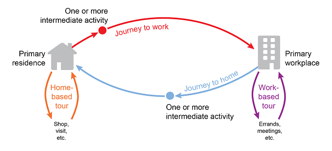
As a crow flies, the average straight-line distance between a Massachusetts resident’s home and primary workplace is 8.8 miles. However, if the trip length is calculated by adding together the straight-line distances of the several trip segments, the average journey to work is 10.0 miles. The journey home is 10.7 miles, reflecting the fact that commuters tend to add more activities to their afternoon commuting trip chain than to the morning chain.
Commuting data are very important for transportation planning because most commuting occurs during peak travel periods. Commuting is also closely linked to the strength of regional employment markets. However, the total number of travel miles in the non-commuting trips chains, such as home-based tours (trip chains that begin and end at home) and work-based tours (trip chains that begin and end at the workplace), actually exceeds the total miles of commuting. Non-commuting travel is done by non-workers, workers who don’t commute, and commuters who didn’t work on the day of their survey. For instance, many workers work weekends and their days off are midweek. Trips that people take from their workplaces during their work day (for lunch trips, running errands, attending meetings and the like) are also considered non-commuting travel. This non-commuting travel is spread over the entire day, resulting in heavy midday traffic and exacerbating rush-hour traffic.
How Do People Get There?
Many surveys have simply asked respondents which mode they chose for a particular type of trip. As I studied the 2011-MTS, I realized that the survey provided enough detail about individual trip segments to allow mode utilization to be measured by number of miles traveled using each mode. This is especially important in accounting for travel that involves more than one mode. Driving to a rail station or walking to transit service are examples of travel miles that should be counted separately.
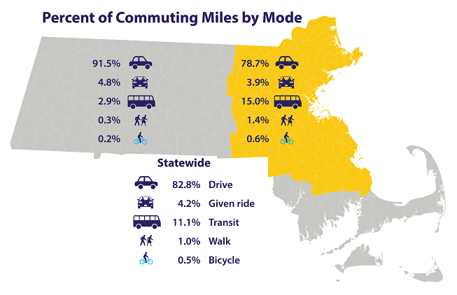
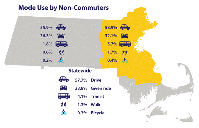
In the accompanying graphics, the percent of travel miles by mode are presented for Massachusetts as a whole, and for two subdivisions of the state: Boston and 163 surrounding municipalities (yellow) and the rest of the state (gray). The first graphic shows use of modes for commuting, and the second shows the modes used by survey respondents who didn’t commute on the survey day.
Driving is the most used mode in all instances, but its prevalence varies. For commuting outside the Boston environs, more than 91 percent of the miles traveled are by driving. Within the Boston environs, transit is used for 15 percent of the commuting miles. Walking and bicycling are several times more important within than outside the Boston environs, but the percentages are still small.
The big surprise in this analysis was the mileage of non-commuters who are given a ride. As I reviewed and reflected on these data, I realized that because none of these respondents ever reach a primary workplace, all their travel on the survey day begins and ends at their primary residence, or in some instances at a friend’s residence. In light of this circumstance, the relatively high likelihood that a friend or family member is driving makes perfect sense.
What Does the Data Tell Us?
This article touches primarily on ways the travel data in the 2011-MTS can be viewed and interpreted. The data compiled in the three reports allow planners to estimate the size and nature of travel submarkets and help in efforts to craft effective transportation policies and programs.
Similar analyses were applied to the earlier household survey conducted in 1991, which covered only the 164 municipalities in the Boston environs. Comparing the two surveys I concluded that commuters now have, on average, about a one-mile longer commute than they had in 1991. This should not be surprising. We have a vibrant job market with employment opportunities popping up throughout the region. Our workers can take on new challenges without changing residence. In this regard our region is fortunate, but its transportation systems must respond and adapt.