
1. Developing the High-Injury Network
Step 2—Create a One-Mile Sliding Window
Step 3—Create a 100-Foot Buffer
Step 4—Aggregate the Crash Scores
Step 5—Calculate Percentile Rankings
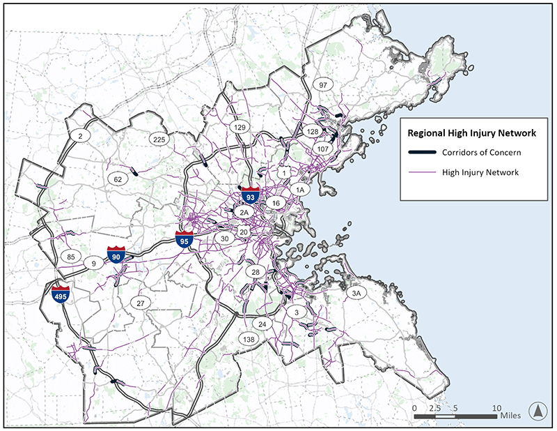
Regional HIN and Corridors of Concern
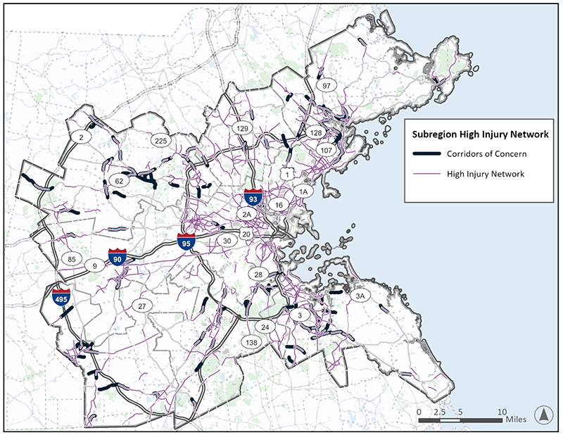
Subregional HINs and Corridors of Concern
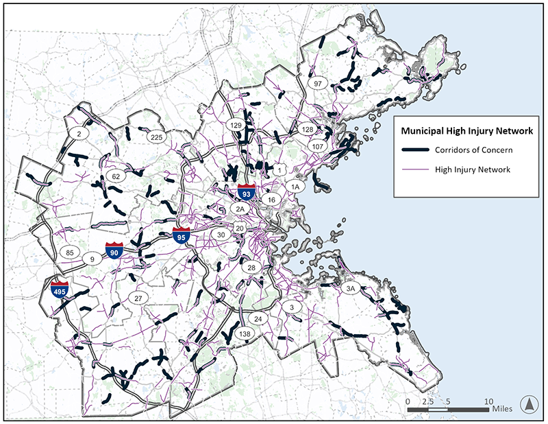
Municipal HINs and Corridors of Concern
2. The High-Injury Network and Communities of Concern
HIN Relative to Area Demographics
Redefined Boston Region MPO COC
3. Prioritizing the High-Injury Network
Proximity to Points of Interest (POI)
Network Scoring and Prioritization
4. Intersection High-Injury Network and Prioritization
Table C-2 | HIN Coverage by Subregion
Table C-3 | Minority Populations and the HIN
Table C-4 | Low-Income Populations and the HIN
Table C-5 | Limited English Proficiency Populations and the HIN
Table C-6 | Disabled Populations and the HIN
Table C-7 | Youth Populations and the HIN
Table C-8 | Elderly Populations and the HIN
Table C-10 | Regional HIN Crash Score Distribution
Table C-11 | Regional HIN Trip Count Distribution
Table C-12 | Regional HIN COC Score Distribution
Table C-13 | Network Screening Elements
Table C-14 | HIN Coverage by Subregion
Table C-15 | HIN Coverage by COC Score Percentile
Figure C-4 | Quincy HIN and Corridors of Concern
Figure C-5 | Revere HIN and Corridors of Concern
Figure C-6 | Needham HIN and Corridors of Concern
Figure C-7 | Bolton HIN and Corridors of Concern
Figure C-8 | Somerville HIN and Corridors of Concern
Figure C-9 | High-Injury Network in Relation to Low-Income, Minority, and LEP Populations
Figure C-10 | High-Injury Network in Relation to Disabled, Older, and Younger Populations
Figure C-11 | High-Injury Network in Relation to US DOT ETC’s Disadvantaged Population Indices
Figure C-12 | Redefined Communities of Concern
Figure C-13 | Regional Prioritized Network
The Boston Region Metropolitan Planning Organization (MPO) is developing a Vision Zero Action Plan supported by a grant from the federal Safe Streets and Roads for All (SS4A) Program. A key component in developing this plan is the creation of a High-Injury Network (HIN)—a series of roadway locations throughout the region on which a high proportion of traffic fatalities and serious injuries occur. This appendix provides a description of the methodology for developing the HIN, the data and criteria used, and key findings from the HIN. The results of the HIN will provide priority locations for tailored treatments throughout the regional, subregional, and municipal transportation networks.
Development of the HIN requires two key forms of data: crash data and roadway data. For the Boston Region MPO HIN, crash data were obtained through the Massachusetts Department of Transportation (MassDOT) IMPACT Crash Data Portal. The data represent years 2018 to 2022.
MassDOT’s Roadway Inventory data were utilized as the spatial base for the HIN, segmenting the roadway every 0.1 miles. Limited-access roads were removed from the dataset, as the focus of this plan is primarily local roads and what the MPO and municipalities can do to address local roadway safety. Also, MassDOT has systems in place for addressing limited-access state-owned roads, and the higher traffic volumes and congested-related crashes would skew the HIN thresholds.
Crashes were assigned to the segments within 100 feet of the crash location. Limited-access roadways and ramps were then removed from the HIN, leaving only partial- and full-access roadways.
The HIN development is one of the main elements of the Vision Zero Action Plan. The purpose of the HIN is to locate roads where the crashes are highest both in terms of frequency and severity. To do so, an HIN sliding window analysis was conducted by using a one-mile window to assess clusters of crashes along the roadway network at the level of Greater Boston Metro Region, the 97 municipalities in the region, and eight subregions: North Shore Task Force (NSTF), North Suburban Planning Council (NSPC), Minuteman Advisory Group on Interlocal Coordination (MAGIC), Inner Core Committee (ICC), MetroWest Regional Collaborative (MWRC), South Shore Coalition (SSC), Three Rivers Interlocal Council (TRIC), and South West Advisory Planning Committee (SWAP). Ranking the roadway segments was completed using a five-step process. Each step is described in further detail below.
The first step in the HIN development is preprocessing the road layer and the crash layer. This includes reviewing the data for errors and anomalies, as well as formatting the data in a way that allows for connecting and joining in geographic information systems (GIS).
The MassDOT road layer was reviewed for any connectivity issues or inconsistencies. The following roadways were excluded from the analysis layer:
The crash data were obtained from the MassDOT IMPACT Crash Data Portal. Crashes that occurred on Interstates and ramps were removed to avoid attributing them to neighboring roadway facilities. The crash layers contain all the crash metadata including crash severity and whether the crash involves a vulnerable road user.
It should be noted that crash data within the City of Waltham show an overrepresentation of the fatal and serious injury crash categories that are not consistent with the previous years. This resulted in the municipality being overrepresented in both the regional and subregional HIN. To remain impartial towards the data, no adjustments have been made to balance the overrepresented fatal and serious injury crashes. Any efforts targeting or prioritizing projects in Waltham based on the regional or subregional HIN should consider this data quality concern when comparing the municipality’s roadways to neighboring municipalities.
In the second step, a one-mile sliding window was created that slides at 0.1-mile increments along each road. This sliding window allows for a localized analysis of crash data, enabling a detailed examination of specific segments of the road network. The movement of the window ensures that all road segments are covered in the analysis and that the largest groupings of crashes are identified. For roads shorter than one mile in length, the entire road was treated as a single segment.
The third step involved creating a 100-foot buffer around each one-mile window. This buffer is essential for capturing the crashes that can be attributed to the roadway segment, including those that were geolocated just outside the travel way. The team experimented with multiple buffer widths, and found a 100-foot buffer was best at addressing limited geolocation precision without attributing crashes to unrelated nearby segments.
In the fourth step, crash scores were aggregated within the created buffers. This aggregation process involved compiling data on crashes that occurred within the buffer. The aggregated scores were calculated based on equivalent property damage only (EPDO) crash cost scores. EPDO assigns a value for each crash based on the severity and the general cost of crashes classified under that severity, relative to property damage only crashes. Values for each crash within a given window/buffer are then added or aggregated together. The aggregation of EPDO scores provide valuable insights into the safety performance of each road segment by including both frequency and severity of crashes in a single metric. Table C-1 provides the EPDO crash values used for the HIN.
Table C-1 | HIN Crash Scoring
| KABCO Severity Category |
Non-VRU Crash Score |
VRU Crash Score |
|---|---|---|
Fatal Injury (K) |
15 |
22.5 |
Suspected Serious Injury (A) |
15 |
22.5 |
Suspected Minor Injury (B) |
2 |
3 |
Possible Injury (C) |
1 |
1.5 |
No Apparent Injury (O) |
0 |
0 |
Source: Boston Region MPO
The final step of the HIN process was to calculate the ranking of the sliding window segments based on the buffer scores. This ranking helps to identify which segments of the road network have seen a higher rate of costly crashes compared to others based on analysis of crash data. The team decided to set the threshold at the top five percent of the roads/crash scores to constitute the HIN. The top five percentile scores were selected to minimize the percentage of roads, while maximizing the coverage of the crashes. About 65 percent of the region’s fatal and serious injury crashes occurred on the HIN.
The Boston Region MPO chose to distinguish between the corridors in the HIN, the severe crash hotspots, and the other corridors with high crash frequencies but lower crash severity. As such, the corridors with two or fewer fatal and serious injury crashes were defined as “corridors of concern” and eliminated from the main HIN.
The HIN was created using a five-step systematic approach to assess and prioritize road safety. The approach utilizes network screening best practices for HIN development. It is also unbiased and replicable.
Table C-2 shows the coverage percentage of the HIN for each of the subregion’s fatal and serious injury crashes compared to the portion of roadway mileage in the subregion. The regional HIN provides substantial coverage of the region’s crashes.
Table C-2 | HIN Coverage by Subregion
| Subregion |
HIN Coverage Percent |
Road Length Percent |
|---|---|---|
Inner Core Committee (ICC) |
67.5% |
8.7% |
Minuteman Advisory Group on Interlocal Coordination (MAGIC) |
64.4% |
6.9% |
MetroWest Regional Collaborative (MWRC) |
48.3% |
5.5% |
North Suburban Planning Council (NSPC) |
65.2% |
7.1% |
North Shore Task Force (NSTF) |
61.6% |
6.7% |
South Shore Coalition (SSC) |
67.7% |
7.3% |
South West Advisory Planning Committee (SWAP) |
64.5% |
6.7% |
Three Rivers Interlocal Council (TRIC) |
58.2% |
6.9% |
Boston Region MPO Regional Network |
65.1% |
6.9% |
Source: Boston Region MPO
The HIN coverage statistics provide a measure of how concentrated or dispersed the crashes are within a certain network. The highest coverage is 67.7 percent for the SSC subregion and 67.5 percent for the ICC subregion, which indicates the crashes are slightly more concentrated, consistent with more urban settings and congested roadways. The lowest coverage is 48.3 percent for the MWRC subregion, which shows that crashes are slightly more dispersed, consistent with the suburban/rural land use types where the network has less traffic and opportunities for conflicts and driver errors are more spread out.
The regional HIN (as shown in Figure C-1) is heavily concentrated around the ICC subregion due to high traffic volumes and high volumes of people walking and biking, which creates opportunities for crash conflicts in the subregion. Most of the identified corridors within the regional HIN have two or more fatal and serious injury crashes, since fatal and serious injury crashes are weighted heavily in the EPDO calculation. Few corridors were labeled as corridors of concern or locations with high EPDO scores despite lower severe crash totals.
Figure C-1 | Regional HIN
The subregional HINs (as shown in Figure C-2) provide a clearer, more nuanced view of the roads that can be crash hotspots within each subregion. These are particularly useful to prioritize targeted safety investments when the projects are tied to geographies within the subregional boundaries. The subregional HINs have a higher percentage of corridors of concern identified than the Regional HIN. This is because the subregional HIN compares crash scores within each subregion, including some suburban/rural subregions that have much lower crash concentrations (and fatal and serious injury crash concentrations) than the ICC subregion.
Figure C-2 | Subregional HIN
The 97 individual municipal HINs (shown in Figure C-3) provide a prioritization tool for each municipality to explore its own roadways and crash hotspots. Smaller municipalities with fewer roads and lower traffic volumes do not appear as frequently on the regional or the subregional HINs, thus the municipal HIN provides a context-sensitive comparison of its network and local roads. Municipalities can also partner with neighboring municipalities to create stronger improvements along roadway segments that transcend town barriers. The municipal HINs have the most corridors of concern identified, to support locations with high EPDO values, even where more than two fatal or serious injury crashes were not observed.
Figure C-3 | Municipal HINs
The following figures (Figure C-4 through Figure C-8) contain examples from five different municipalities that represent different land uses, ranging from heavily urban to rural contexts. The HIN for each of these municipalities provides prioritization of higher crash roadways within the municipalities and allows decision makers to prioritize these roadways for future safety improvements and funding.
Figure C-4 | Quincy HIN and Corridors of Concern
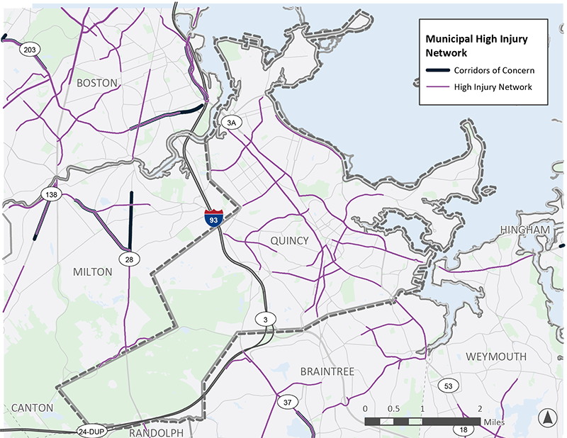
Figure C-5 | Revere HIN and Corridors of Concern
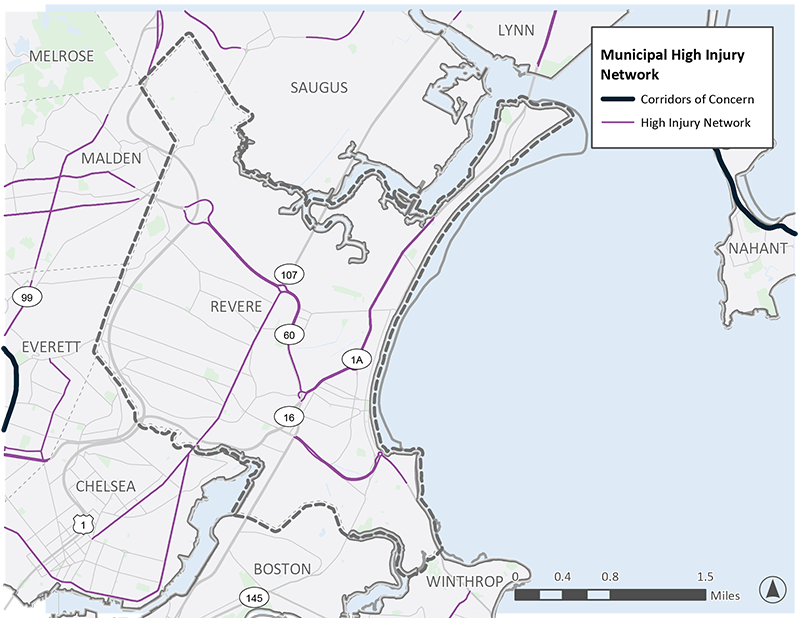
Figure C-6 | Needham HIN and Corridors of Concern
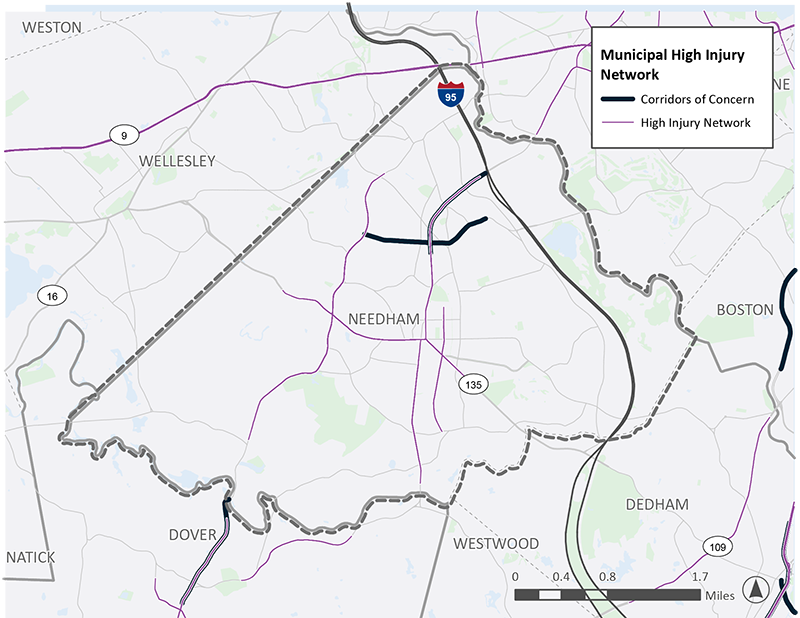
Figure C-7 | Bolton HIN and Corridors of Concern
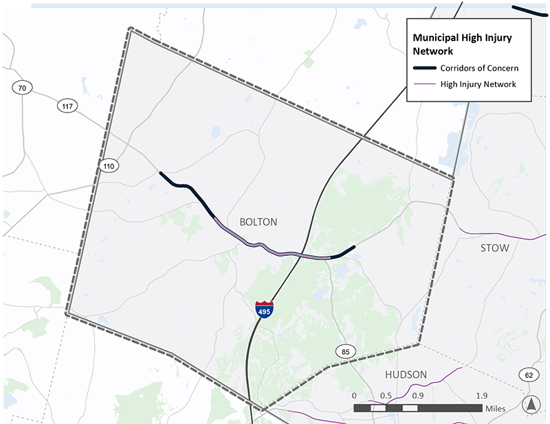
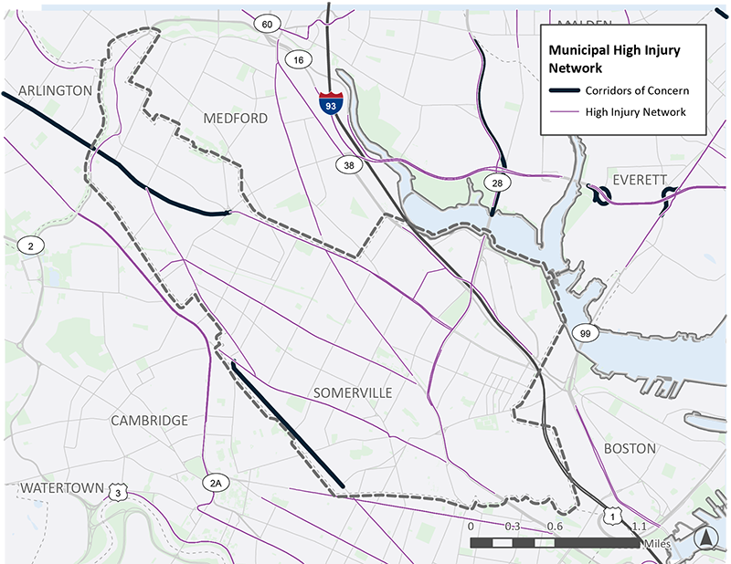
Figure C-8 | Somerville HIN and Corridors of Concern
An objective of Task 2.4 was to identify Communities of Concern (COC), that are disproportionately exposed to high crash infrastructure, as defined by the High-Injury Network (HIN) (developed in Task 2.3). The analysis conducted under Task 2.4 informs the prioritization of high-injury network corridors for targeted safety investments (Task 5 of the development of the Boston Region Vision Zero Action Plan).
Findings from the Task 2.4 analyses suggest that areas with a higher share of low-income, minority, and/or limited-English proficiency (LEP) individuals also have a greater share of roadway segments included in the HIN.
Findings indicate that roadways in areas with a higher share of low-income, minority, and/or LEP populations (and to a lesser extent, areas with a relatively higher share of individuals with a disability) consist of a greater share of the HIN relative to the area’s roadway miles.
Prioritization of safety investments in areas with a high share of minority, low-income, and LEP populations would address the disproportionate number of crashes and support underserved communities.
The task objective was to identify communities that are disproportionately exposed to roadways with a high number of severe crashes. This task consisted of using GIS to compare the location of the HIN against the census tract demographics. Census tracts are a useful geography for this investigation as these areas tend to have the same boundary over the census years, generally an average population of about 4,000 people, and can be tied to various socio-demographic characteristics.
There are various ways to consider demographics to understand whether the HIN falls disproportionally in different communities. For an initial investigation, two existing sources that define COC populations were used: one based on the MPO’s definition of communities of concern and one based on US DOT’s definition. Both databases define areas associated with protected populations under civil rights laws and environmental justice directives. Other sources were considered (e.g., CDC/ATSDR Social Vulnerability Index), yet these were not applied in the examination of the HIN because these sources use the same underlying data sets (US Census surveys) and would result in similar outcomes under civil rights laws and environmental justice directives.1 Other sources were considered (e.g., CDC/ATSDR Social Vulnerability Index), yet these were not applied in the examination of the HIN because these sources use the same underlying data sets (US Census surveys) and would result in similar outcomes.
The Boston Region MPO provided a database of the region’s census tracts with the number and share of populations associated with their definitions of (a) Low-income; (b) Minority; (c) LEP; (d) Older Adults (age 75 or older); (e) Young People (age 17 and under); and (f) Disabled. In this database, areas where the share of population in that demographic category is higher than MPO region’s average for that demographic category are identified as a community of concern.2
As described later in this memorandum, the project team explored variations of how to prioritize Communities of Concern using the share of population within these demographic categories and the Census tract’s percentile rank within the Boston Region.
As an alternative to the Boston Region MPO’s COC database, two datasets from US DOT (the Equitable Transportation Community [ETC] Social Vulnerability index and the ETC Transportation Insecurity index) were analyzed to understand these indices relative to the HIN. The ETC Explorer tool is “an interactive web application that uses 2020 Census tracts and data, to explore the cumulative burden communities experience, as a result of underinvestment in transportation.” The use of the tool is intended to “help ensure the benefits of DOT’s investments are addressing the transportation related causes of disadvantage” and to “understand how [an area] is experiencing [a] burden that transportation investments can mitigate or reverse.”3 Furthermore, US DOT states that the ETC Explorer “provides MPOs, State DOTs, and local decision makers tools to help select projects that meet the transportation needs of areas, which in turn will help strengthen communities and create more opportunities to improve daily life.”
This database is also organized by census tract. The ETC’s Social Vulnerability index is a measure of 13 socioeconomic indicators “that have a direct impact on quality of life. This set of indicators measure lack of employment, educational attainment, poverty, housing tenure, access to broadband, and housing cost burden as well as identifying household characteristics such as age, disability status and English proficiency.” The Transportation Insecurity index is intended to represent “when people are unable to get to where they need to go to meet the needs of their daily life regularly, reliably, and safely.”4
As noted by the Boston Region MPO’s own geographical analyses of COC populations in the Boston region, in general, minority populations, people with low incomes, and people with limited English proficiency tend to live closer to or in the city of Boston, whereas people age 75 years or older, people age 17 years or younger, and people with disabilities are dispersed throughout the region.5 By exploring the association of the geographic distribution and concentrations of COC populations against the location of the HIN, it can be determined whether a greater share of the HIN falls within areas with high concentrations of COC populations.
The project team performed two sets of screening analyses:
Figure C-9 and Figure C-10 show the comparison between the share of the HIN and the share of the entire roadway network that overlap with specific COC. Situations where the HIN overlaps more with COC compared to the entire roadway network indicate a stronger correlation between those COC and high-injury crash areas.
Comparing COC with the HIN produce the following findings:
Figure C-9 | High-Injury Network in Relation to Low-Income, Minority, and LEP Populations
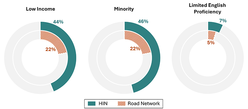
Source: US Census Bureau; 2020 Decennial Census Demographic and Housing Characteristics and 2018–22 American Community Survey.
Figure C-10 | High-Injury Network in Relation to Disabled, Older, and Younger Populations
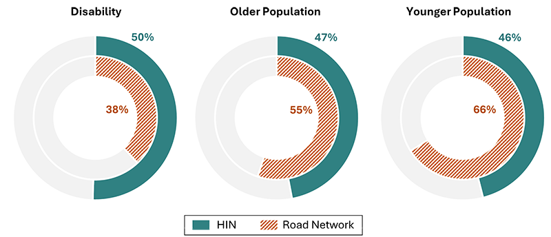
Source: US Census Bureau; 2020 Decennial Census Demographic and Housing Characteristics and 2018–22 American Community Survey.
In addition to specific populations based on one demographic characteristic, the HIN can also be compared to more holistic measures of disadvantage, such as
Results of this comparison are seen in Figure C-11. The Social Vulnerability Index is significantly over-represented (40 percent versus 20 percent) in the HIN and the Transportation Insecurity Index is not over-represented (33 percent versus 52 percent).
Figure C-11 | High-Injury Network in Relation to US DOT ETC’s Disadvantaged Population Indices
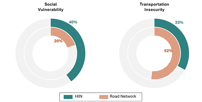
Source: US DOT ETC Explorer, Homepage: https://experience.arcgis.com/experience/0920984aa80a4362b8778d779b090723/page/Homepage/. Note: As of May 2025, this page has been taken down by US DOT.
The project team performed a refined analysis to confirm the initial findings, further identify the HIN relative to COC, and point to which demographic categories could factor in the prioritization of the HIN for safety investments. The screening uses characteristics tied to the census tract level. Tracts are compared against each other according to their percentile rank of the characteristic among the Boston Region MPO’s geography.
In reviewing the Boston Region MPO’s census tracts based on their percentile rank associated with the share of each COC, areas with a higher share of minority, low-income, LEP, and (to a lesser extent) disabled populations tend to have a higher share of the HIN relative to the area’s roadways:
Summary tables associated with this screening are provided below in Table C-3 through Table C-8 .
Table C-3 | Minority Populations and the HIN
| Quintile |
Population Totals |
Share of MPO Population |
Roadway Network |
|||||
|---|---|---|---|---|---|---|---|---|
| Minority Population |
Total Population |
Percent Minority |
Minority Population |
Total Population |
Share of MPO Road Miles |
Share of HIN Miles |
Ratio |
|
1 |
479,667 |
636,800 |
75.3% |
39.2% |
19.0% |
9.1% |
20.8% |
2.29 |
2 |
303,836 |
653,583 |
46.5% |
24.8% |
19.5% |
12.5% |
24.1% |
1.92 |
3 |
203,697 |
648,715 |
31.4% |
16.6% |
19.3% |
18.1% |
22.3% |
1.23 |
4 |
151,681 |
701,590 |
21.6% |
12.4% |
20.9% |
26.9% |
17.8% |
0.66 |
5 |
84,934 |
716,506 |
11.9% |
6.9% |
21.3% |
33.3% |
14.9% |
0.45 |
Total |
1,223,835 |
3,357,194 |
36.5% |
100.0% |
100.0% |
100.0% |
100.0% |
1.00 |
Source: US Census Bureau; 2020 Decennial Census Demographic and Housing Characteristics and 2018–22 American Community Survey.
Table C-4 | Low-Income Populations and the HIN
| Quintile |
Population Totals |
Share of MPO Population |
Roadway Network |
|||||
|---|---|---|---|---|---|---|---|---|
| Low-Income Population |
Total Population |
Percent Low-Income |
Low-Income Population |
Total Population |
Share of MPO Road Miles |
Share of HIN Miles |
Ratio |
|
1 |
246,067 |
567,200 |
43.4% |
39.3% |
17.6% |
7.6% |
17.9% |
2.36 |
2 |
167,357 |
670,740 |
25.0% |
26.7% |
20.8% |
14.2% |
24.4% |
1.71 |
3 |
104,333 |
657,505 |
15.9% |
16.7% |
20.4% |
20.2% |
22.3% |
1.11 |
4 |
69,811 |
663,679 |
10.5% |
11.1% |
20.6% |
26.1% |
18.8% |
0.72 |
5 |
38,623 |
665,204 |
5.8% |
6.2% |
20.6% |
31.9% |
16.6% |
0.52 |
Total |
626,191 |
3,224,328 |
19.4% |
100.0% |
100.0% |
100.0% |
100.0% |
1.00 |
Source: US Census Bureau; 2020 Decennial Census Demographic and Housing Characteristics and 2018–22 American Community Survey.
Table C-5 | Limited English Proficiency Populations and the HIN
| Quintile |
Population Totals |
Share of MPO Population |
Roadway Network |
|||||
|---|---|---|---|---|---|---|---|---|
| LEP Population |
Total Population |
Percent LEP |
LEP Population |
Total Population |
Share of MPO Road Miles |
Share of HIN Miles |
Ratio |
|
1 |
186,181 |
618,628 |
30.1% |
51.3% |
19.6% |
9.3% |
21.3% |
2.29 |
2 |
87,253 |
607,668 |
14.4% |
24.1% |
19.2% |
13.6% |
22.1% |
1.63 |
3 |
50,126 |
647,910 |
7.7% |
13.8% |
20.5% |
20.3% |
22.1% |
1.09 |
4 |
29,300 |
684,477 |
4.3% |
8.1% |
21.7% |
25.7% |
19.6% |
0.76 |
5 |
9,819 |
602,423 |
1.6% |
2.7% |
19.1% |
31.2% |
14.9% |
0.48 |
Total |
362,679 |
3,161,106 |
11.5% |
100.0% |
100.1% |
100.1% |
100.0% |
1.00 |
Source: US Census Bureau; 2020 Decennial Census Demographic and Housing Characteristics and 2018–22 American Community Survey.
Table C-6 | Disabled Populations and the HIN
| Quintile |
Population Totals |
Share of MPO Population |
Roadway Network |
|||||
|---|---|---|---|---|---|---|---|---|
| Disability Population |
Total Population |
Percent Disability |
Disability Population |
Total Population |
Share of MPO Road Miles |
Share of HIN Miles |
Ratio |
|
1 |
112,337 |
649,528 |
17.3% |
33.2% |
19.6% |
13.8% |
20.6% |
1.49 |
2 |
81,937 |
695,092 |
11.8% |
24.2% |
21.0% |
20.0% |
22.7% |
1.14 |
3 |
65,683 |
691,494 |
9.5% |
19.4% |
20.9% |
23.0% |
19.1% |
0.83 |
4 |
50,654 |
692,571 |
7.3% |
15.0% |
20.9% |
22.5% |
21.4% |
0.95 |
5 |
28,040 |
578,101 |
4.9% |
8.3% |
17.5% |
20.8% |
16.2% |
0.78 |
Total |
338,651 |
3,306,786 |
10.2% |
100.1% |
99.9% |
100.1% |
100.0% |
1.00 |
Source: US Census Bureau; 2020 Decennial Census Demographic and Housing Characteristics and 2018–22 American Community Survey.
Table C-7 | Youth Populations and the HIN
| Quintile |
Population Totals |
Share of MPO Population |
Roadway Network |
|||||
|---|---|---|---|---|---|---|---|---|
| Youth Population |
Total Population |
Percent Youth |
Youth Population |
Total Population |
Share of MPO Road Miles |
Share of HIN Miles |
Ratio |
|
1 |
186,706 |
712,149 |
26.2% |
29.4% |
21.2% |
26.4% |
15.7% |
0.59 |
2 |
166,983 |
761,759 |
21.9% |
26.3% |
22.7% |
27.1% |
18.9% |
0.70 |
3 |
139,170 |
729,136 |
19.1% |
21.9% |
21.7% |
22.5% |
24.8% |
1.10 |
4 |
95,942 |
611,031 |
15.7% |
15.1% |
18.2% |
16.3% |
25.5% |
1.56 |
5 |
45,685 |
543,119 |
8.4% |
7.2% |
16.2% |
7.7% |
15.2% |
1.97 |
Total |
634,486 |
3,357,194 |
18.9% |
99.9% |
100.0% |
100.0% |
100.1% |
1.00 |
Source: US Census Bureau; 2020 Decennial Census Demographic and Housing Characteristics and 2018–22 American Community Survey.
Table C-8 | Elderly Populations and the HIN
| Quintile |
Population Totals |
Share of MPO Population |
Roadway Network |
|||||
|---|---|---|---|---|---|---|---|---|
| Elderly Population |
Total Population |
Percent Elderly |
Elderly Population |
Total Population |
Share of MPO Road Miles |
Share of HIN Miles |
Ratio |
|
1 |
81,653 |
695,863 |
11.7% |
34.8% |
20.7% |
27.6% |
23.3% |
0.84 |
2 |
57,914 |
732,123 |
7.9% |
24.7% |
21.8% |
26.2% |
20.9% |
0.80 |
3 |
46,133 |
724,762 |
6.4% |
19.6% |
21.6% |
23.1% |
20.4% |
0.88 |
4 |
32,957 |
661,890 |
5.0% |
14.0% |
19.7% |
14.9% |
18.3% |
1.23 |
5 |
16,157 |
542,556 |
3.0% |
6.9% |
16.2% |
8.3% |
17.1% |
2.06 |
Total |
234,814 |
3,357,194 |
7.0% |
100.0% |
100.0% |
100.1% |
100.0% |
1.00 |
Source: US Census Bureau; 2020 Decennial Census Demographic and Housing Characteristics and 2018–22 American Community Survey.
The project team performed a correlation analysis to further assess the relationship between the COC population percentile ranks and the percentage of roads within the census tract that are on the HIN. Through this correlation analysis, the team can identify which demographic groups have higher exposure to the HIN. These identified groups can be prioritized because of their higher correlation with roadways designated as high injury within their census tracts.
The analysis involved the following steps:
The analysis identified that the primary populations that correlate with a higher proportion of the HIN in relation to the road network are Minority, Low-Income, LEP, and Disability. Notably, Youth Population and Elderly Population were found to have a negative correlation with the percentage of HIN roads. These findings generally align with the conclusions from the refined screening analysis that investigated the populations by quintile group.
More detailed results from the analysis are shown in Table C-9.
Table C-9 | Correlations between Share of Transportation COC Population and HIN Proportion of Area Roadways
Community |
Minority Share |
LEP |
Youth |
Elderly |
Disability Share |
Low-Income Share |
HIN |
Minority Share |
1 |
0.78 |
0.035 |
-0.48 |
0.27 |
0.65 |
0.42 |
LEP Share |
0.78 |
1 |
-0.00022 |
-0.28 |
0.39 |
0.68 |
0.35 |
Youth Share |
0.035 |
-0.00022 |
1 |
0.092 |
0.015 |
-0.19 |
-0.24 |
Elderly Share |
-0.48 |
-0.28 |
0.092 |
1 |
0.17 |
-0.35 |
-0.21 |
Disability Share |
0.27 |
0.39 |
0.015 |
0.17 |
1 |
0.46 |
0.084 |
Low-Income Share |
0.65 |
0.68 |
-0.19 |
-0.35 |
0.46 |
1 |
0.37 |
HIN Proportion |
0.42 |
0.35 |
-0.24 |
-0.21 |
0.084 |
0.37 |
1 |
The refined screening examined the relationship between the HIN and different demographic characteristics at the census tract level. Four groups were identified as most likely affected by high-injury corridors, including Minority, Low-income, LEP, and Disability. Considering the disproportional impacts of HINs on these groups, segments located in communities with high concentrations of the identified populations should be prioritized for potential safety improvement. To achieve this, the COCs defined by the Boston Region MPO were redefined to account for the stronger correlation between the identified demographic groups and higher HIN proportions.
A scoring system was developed for census tracts based on the share of their populations belonging to the identified demographic groups. Because Disability group showed a significantly weaker correlation with HIN proportion compared to the other three groups (as shown in Table C-9 ), it was excluded from the scoring system. The percentile ranks of population shares of minority, low-income, and LEP groups were equally weighted to form a single percentile rank for each census tract, defined as the COC score and calculated as
Where is the percentile rank of the population share for each demographic group within the census tract.
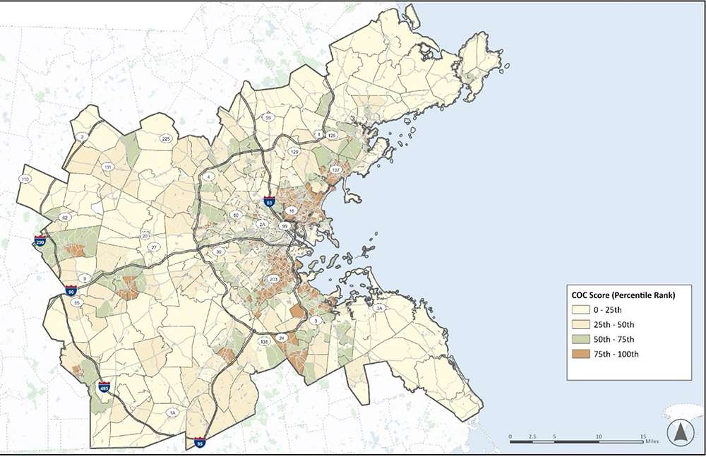
Using the scoring system, census tracts with higher concentrations of minority, low-income, and LEP populations received higher COC scores. Based on the quartile distribution of the COC scores, tracts were categorized into four levels of marginalization: most marginalized (top 25th percentile or 75th–100th percentile), more marginalized (50th–75th percentile), less marginalized (25th–50th percentile), and least marginalized (bottom 25th percentile or 0–25th percentile), as shown in Figure C-12. The percentile rank of each COC score was then incorporated into the prioritization of HINs. This allows transportation agencies to focus safety improvement efforts on areas where they are most needed, and ensures that the prioritization process aligns with the MPO’s vision of building an equitable transportation system, with an emphasis on improving outcomes for populations disproportionately exposed to dangerous roadways.
Figure C-12 | Redefined Communities of Concern
While the HIN identifies locations with the highest concentrations of fatal and serious injury crashes, incorporating additional factors, such as land use and traffic volume datasets, can further refine the selection of locations with the greatest potential for safety improvement. This effort led to Prioritized HINs, developed from the established HINs at the regional, subregional, and municipal levels.
For the priority network development, a set of screening elements were selected to supplement crash history data with additional factors that influence travel behavior and contribute to risk exposure. Each screening element is discussed below, along with its data sources and processing steps.
With the established HIN as a starting point, a numerical rank was assigned to each corridor based on its calculated crash score (discussed in Step 4—Aggregate the Crash Scores) relative to all other corridors in the network. This numerical rank was then converted to a percentile score by dividing the rank by the total number of corridors in the network and multiplying by 100. Table C-10 shows crash scores at 25th percentile intervals for all regional HIN segments. For the subregional and municipal networks, crash scores associated with each percentile rank will vary.
Table C-10 | Regional HIN Crash Score Distribution
| Percentile Rank |
Crash Score |
|---|---|
0 (minimum) |
75.5 |
25th |
92 |
50th (median) |
117.5 |
75th |
165 |
100th (maximum) |
798.5 |
The resulting percentile crash scores, which reflect both crash frequency and severity, were included as a key screening element to ensure that locations with the most significant severe crash histories receive greater priority.
In addition to crash history, trip activity can also serve as an indicator of potential exposure to crash risks. For this element, Replica data was used to obtain weekly total trip counts and VRU trip counts for each census tract in the Boston Region between June 2022 and January 2023.
All HIN corridors within the same census tract were assigned the same trip counts. Percentile scores were then calculated separately based on the ranking of each corridor’s total trips and VRU trips relative to all other corridors in the HIN. These trip activity data help identify corridors with high amounts of exposure, even without significant crash history. Table C-11 summarizes total trip counts and VRU trip counts at 25th percentile intervals for all regional HIN segments. Corresponding trip counts will differ for the subregional and municipal networks.
Table C-11 | Regional HIN Trip Count Distribution
| Percentile Rank |
Total Trip Count |
VRU Trip Count |
|---|---|---|
0 (minimum) |
0 |
0 |
25th |
12,011 |
1,821 |
50th (median) |
17,516 |
2,477 |
75th |
22,976 |
3,414 |
100th (maximum) |
96,099 |
18,624 |
As indicated by the correlation analysis between various demographic groups and the HIN in Section 2, prioritization of safety investments in areas with a high share of minority, low-income, and LEP populations would address the disproportionate number of crashes and support Communities of Concern.
To integrate equity into the prioritization process, COC scores were calculated for each census tract based on the share of identified populations and their percentile ranks within the Boston Region. These COC scores were then converted into percentile scores and assigned to all corridors within the corresponding census tract. Table C-12 shows the COC scores at 25th percentile intervals for all regional HIN segments. The COC scores associated with each percentile rank will vary across the subregional and municipal networks.
Table C-12 | Regional HIN COC Score Distribution
| Percentile Rank |
Communities of Concern Score |
|---|---|
0 (minimum) |
4 |
25th |
35 |
50th (median) |
52 |
75th |
76 |
100th (maximum) |
98 |
Since points of interest like schools and transit stops tend to generate higher volumes of walking and biking activity, proximity to these locations can be used as a surrogate measure to estimate demand and exposure for VRUs.
The Boston Region MPO provided POI data for multiple types of locations, including:
For the analysis, a 500-foot buffer was created around each HIN corridor, and the number of POIs within the buffer was counted. Four binary indicators were created based on the presence of 1) healthcare facilities; 2) education facilities; 3) transit stops; and 4) other POIs including parks, open space, jobs, and amenities.
Considering the goal of reducing the frequency and severity of crashes while emphasizing COC, different weights were assigned to each screening element, as shown in Table C-13.
For each HIN segment, a weighted score was calculated by combining the selected screening elements based on their assigned weights. These weighted scores were then normalized within the respective network. In each region, each subregion, or each municipality (depending on the network level), the highest-scoring corridor received a normalized score of 100, while all other corridors received a normalized score calculated as their original score divided by the highest score. This final, normalized score is considered as the priority score.
Table C-13 | Network Screening Elements
| Network Screening Elements |
Scoring Criteria |
Weight |
|---|---|---|
Crash Score |
Ranked percentile crash score |
50 |
Communities of Concern |
Ranked percentile COC score |
20 |
Total Trip Activity |
Ranked percentile trip activity score |
5 |
Vulnerable Road User Trip Activity |
Ranked percentile VRU trip activity score |
5 |
Presence of a Healthcare Facility |
True if a healthcare facility is present within 500 ft of the corridor, false otherwise |
5 |
Presence of an Education Facility |
True if an education facility is present within 500 ft of the corridor, false otherwise |
5 |
Presence of a Transit Stop |
True if a transit stop is present within 500 ft of the corridor, false otherwise |
5 |
Presence of Other Points of Interest |
True if any of the other points of interest are present within 500 ft of the corridor, false otherwise |
5 |
Maximum Total Score |
|
100 |
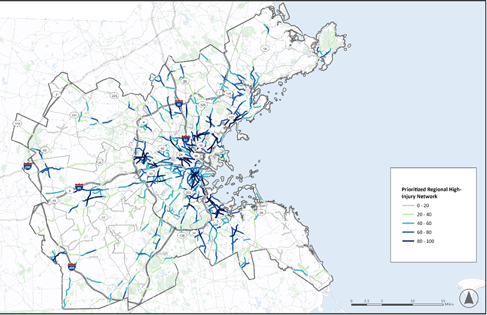
Using the priority scores, corridors were ranked to identify high-priority locations at the regional, subregional, and municipal levels. These high-priority corridors can then guide the development of targeted countermeasures that align with the identified Emphasis Areas and that follow the Safe System Approach. The final regional prioritized network is shown in Figure C-13.
In the main Safety Action Plan, the five top-scoring corridors were identified in each subregion. Corridors are distinct from segments; corridors consist of several overlapping segments along a single roadway. These were identified using the following process:
More detailed information and maps of the five top-scoring corridors within each subregion are provided in the main Safety Action Plan.
Figure C-13 | Regional Prioritized Network
Since intersections often experience a significantly higher concentration of crashes due to having more conflict points than roadway segments, an intersection HIN analysis was conducted alongside the segment HIN to create a comprehensive network for the Boston Region. Similar to the segment HINs, prioritization was also performed on intersection HINs to further refine the locations with the greatest potential for overall safety improvement.
Crash data from 2018 to 2022 were collected from the MassDOT IMPACT Crash Data Portal. Crashes that occurred on fully access-controlled roadways and ramps were excluded. Intersection data were obtained from the “Network Screening Risk Safety Analysis 2017–2021” geodatabase, which was produced and published by MassDOT as part of the risk-based screening analysis for intersection angle crashes.
The purpose of the HIN is to identify locations with the highest concentrations of severe crashes. To achieve this, the intersection HINs were developed based on aggregated EPDO crash scores calculated for each intersection, accounting for crash severity, frequency, and VRU involvement. The process was generally consistent with the development of segment HINs, except that intersections did not require a sliding window analysis since they are discrete locations.
Similar to segment HINs, intersections with crash scores in the top five percent were first selected, then the ones with fewer than one fatal or serious injury crash were classified as “intersections of concern’, while the remainder formed the HIN. This approach ensures that the HIN remains a manageable subset of the intersection network, which allows agencies to focus their resources towards the most critical locations.
Separate intersection HINs were developed at the regional, subregional, and municipal levels. Prioritization was then performed following the same process described in Section 3.
At the regional level, 4.7 percent of intersections were included in the HIN, capturing 69.5 percent of region’s fatal and serious injury crashes. Table C-14 summarizes the percentage of fatal and serious injury crashes captured by each regional HIN and the share of intersections included.
Table C-14 | HIN Coverage by Subregion
| Subregion |
HIN Coverage Percent |
Intersection Percent |
|---|---|---|
Inner Core Committee (ICC) |
60.8% |
4.6% |
Minuteman Advisory Group on Interlocal Coordination (MAGIC) |
100.0% |
3.7% |
MetroWest Regional Collaborative (MWRC) |
69.7% |
4.6% |
North Suburban Planning Council (NSPC) |
66.7% |
3.4% |
North Shore Task Force (NSTF) |
79.1% |
4.0% |
South Shore Coalition (SSC) |
68.4% |
4.4% |
South West Advisory Planning Committee (SWAP) |
62.9% |
4.1% |
Three Rivers Interlocal Council (TRIC) |
74.7% |
4.3% |
Boston Region MPO Regional Network |
69.5% |
4.7% |
Among the eight subregions, the MAGIC subregion had the highest coverage, with its intersection HIN capturing 100 percent of fatal and serious injury crashes. In contrast, the ICC subregional HIN captured only 60.8 percent, indicating a lower concentration of severe crashes in its roadway network.
Compared with urban areas, suburban and rural areas tend to experience fewer total crashes but a higher proportion of fatal and serious injury crashes due to factors such as lower traffic volumes, higher operating speeds, and fewer safety treatments. As a result, even one fatal or serious injury crash at a suburban or rural intersection often ensures its inclusion in the HIN, since these crash types were given much higher weights in the crash cost calculation. Consequently, suburban and rural HIN intersections tend to capture a greater share of fatal or serious injury crashes than those in urban areas.
To assess whether communities with higher COC scores in the Boston Region experience a greater burden of intersection-related crashes, census tracts were grouped into 25th percentile intervals based on their COC scores, and the percentage of intersections identified on the regional HIN was calculated for each group.
As shown in Table C-15 C-15, the share of HIN intersections increases with higher COC scores. Census tracts with COC scores in the top 25th percentile have more than three times the share of HIN intersections compared with tracts in the bottom 25th percentile. Given the components of the COC scores, this finding suggests that tracts with higher proportions of low-income, minority, and LEP populations have a disproportionately high concentration of intersections on the regional HIN, which also reflects a greater burden of severe intersection crash risk.
Table C-15 | HIN Coverage by COC Score Percentile
| COC Score Percentile |
Number of HIN Intersections |
Number of All Intersections |
Percent of HIN Intersections |
|---|---|---|---|
0–25th |
140 |
5,993 |
2.3% |
25th–50th |
212 |
5,952 |
3.6% |
50th–75th |
293 |
5,971 |
4.9% |
75th–100th |
470 |
5,967 |
7.9% |
1 Environmental Justice (EJ) at the Federal Highway Administration (FHWA) means identifying and addressing disproportionately high and adverse effects of the agency’s programs, policies, and activities on minority populations and low-income populations to achieve a fair distribution of benefits and burdens. Similarly, the Federal Transit Administration’s EJ Circular 4703.1, issued August 2015, further directs MPOs to identify and address disproportionately high and adverse effects (referred to as disproportionate burdens) of its activities on minority populations and low-income populations.
2 The U.S. Census Bureau data sources for these demographic characteristics include:
3 U.S. DOT ETC Explorer, Homepage: https://experience.arcgis.com/experience/0920984aa80a4362b8778d779b090723/page/Homepage/. Note: As of May 2025, this page has been taken down by U.S. DOT.
4 U.S. DOT ETC Explorer, Understanding the Data: https://experience.arcgis.com/experience/0920984aa80a4362b8778d779b090723/page/Understanding-the-Data/. Note: As of May 2025, this page has been taken down by U.S. DOT.
5 Transportation Improvement Program (TIP): Federal Fiscal Years 2024–28, Geographical Analyses of Populations in the Boston Region, www.ctps.org/data/pdf/plans/TIP/FFYs-2024-2028-TIP.pdf#page=335.